Linkurious
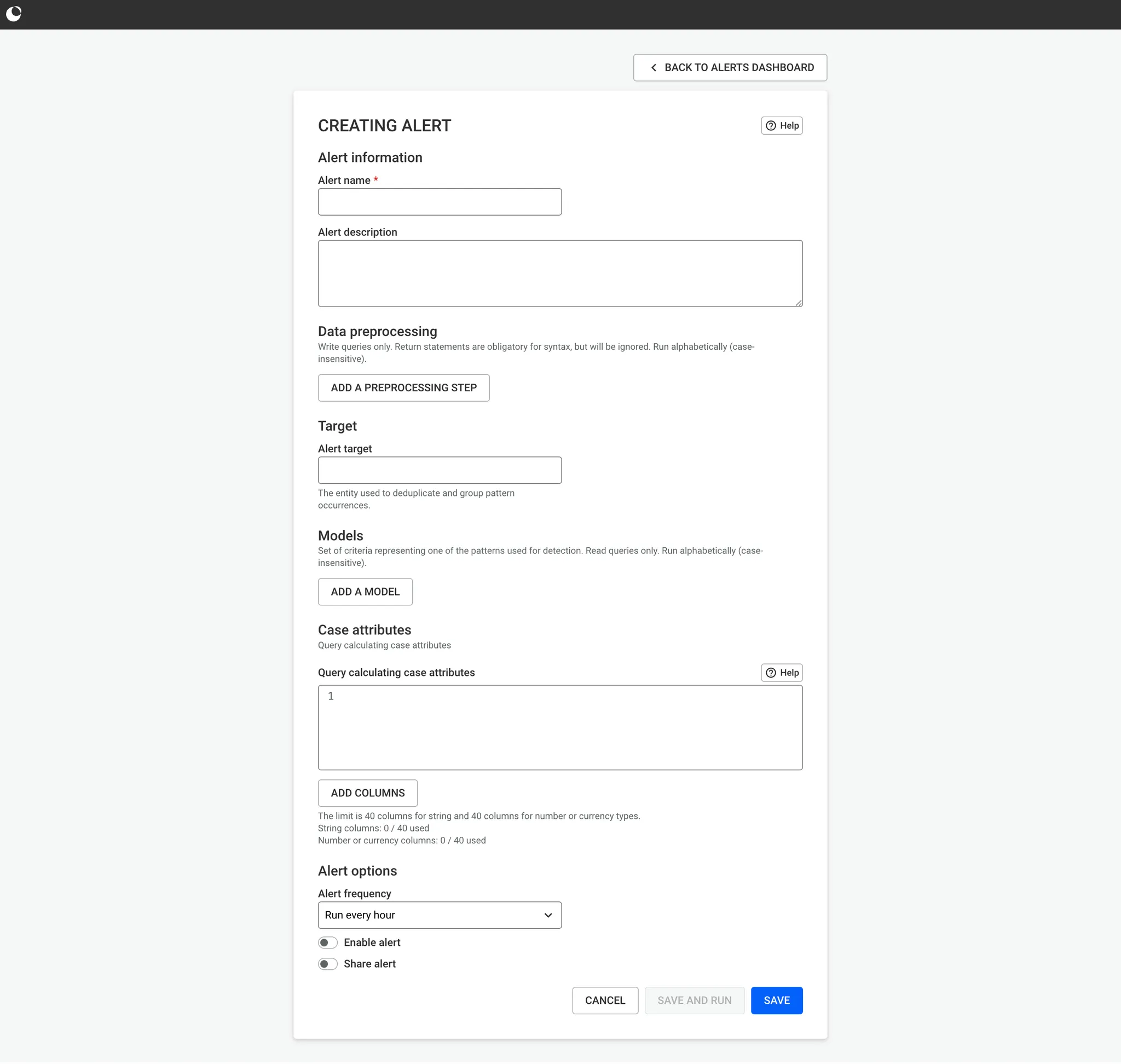
| Current screen for the "Alert Creation"
| The tasks that i've been given :
One of the most important element to not fall into is : survivor bias. The risk : disturb too much the user-flow for users that doesn't have a problem with the current Alert feature.
It's important to, first, understand why some people are able to use it.
- Maybe the interaction isn't common ?
- If others users manage to use it, what types of applications are they also using ?
- What kind of support do they use ?
- What is the goal of their usage ? Is it aligned with how the feature was originally intended to be used ?
| Tools

Figma

Figjam
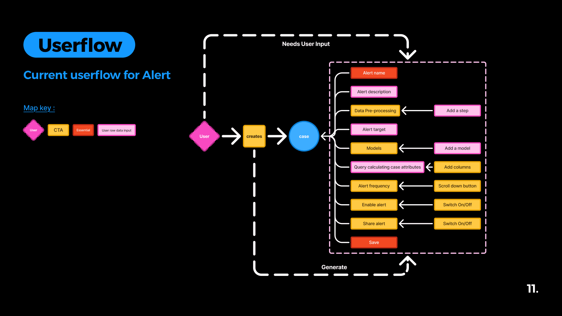
| A Figjam of the current userflow for the Alert feature
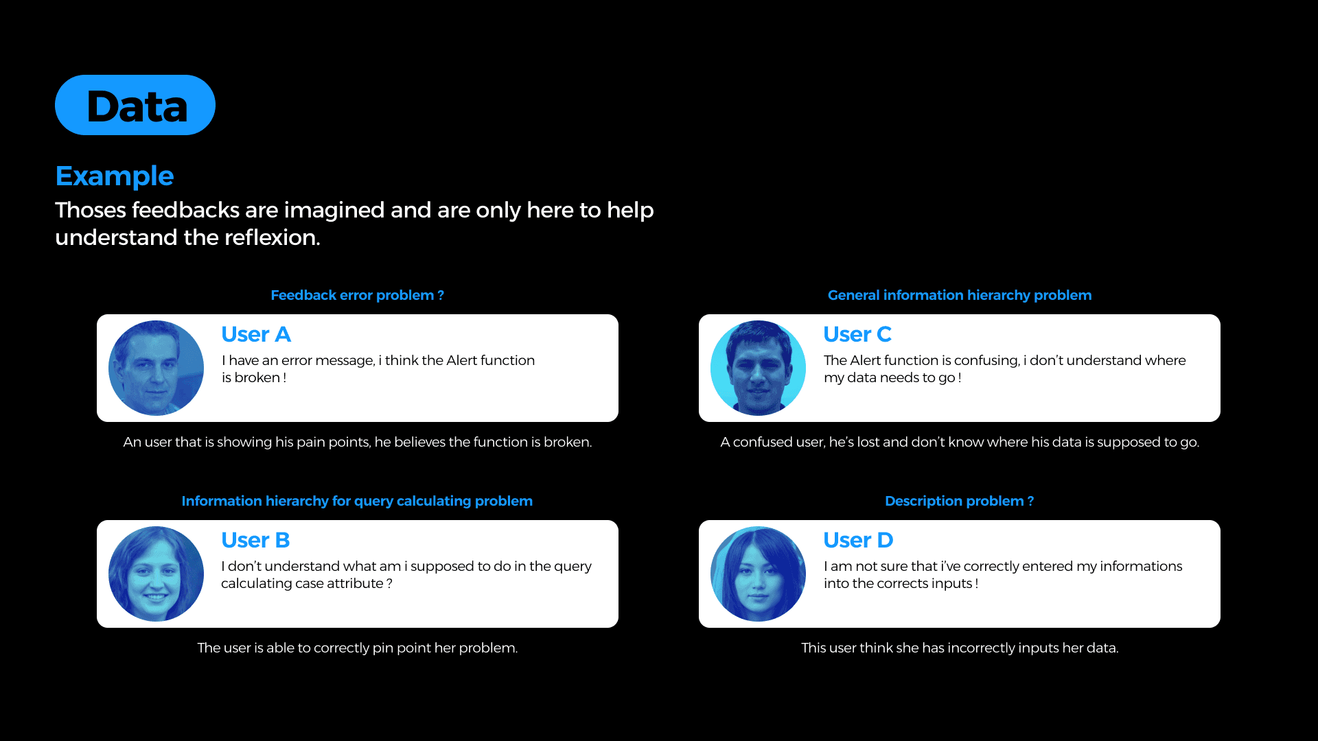
For this type of case the use of data is very important to understand where problems lies. What kind of data are we looking for ?
Mainly feedbacks but also fail alert creation. This kinds of data will help us to avoid survivor bias. However it is important to keep in mind that context is important for the understanding.
The risk : At this point, asking directly to a user can lead to be blindsided by the needs. Which can lead to improvement that disturb currents users.
One of the most important element is to limit dev works.
This will help reduce the amount of time spent on this modification.
- Prioritize "Quick-fix quick-win"
- What are the technical limitations for this case ? What type of librairy might be impacted ?
- Does this project has a deadline ? How should we prioritize it ?
But we will need to beware of technical debt !
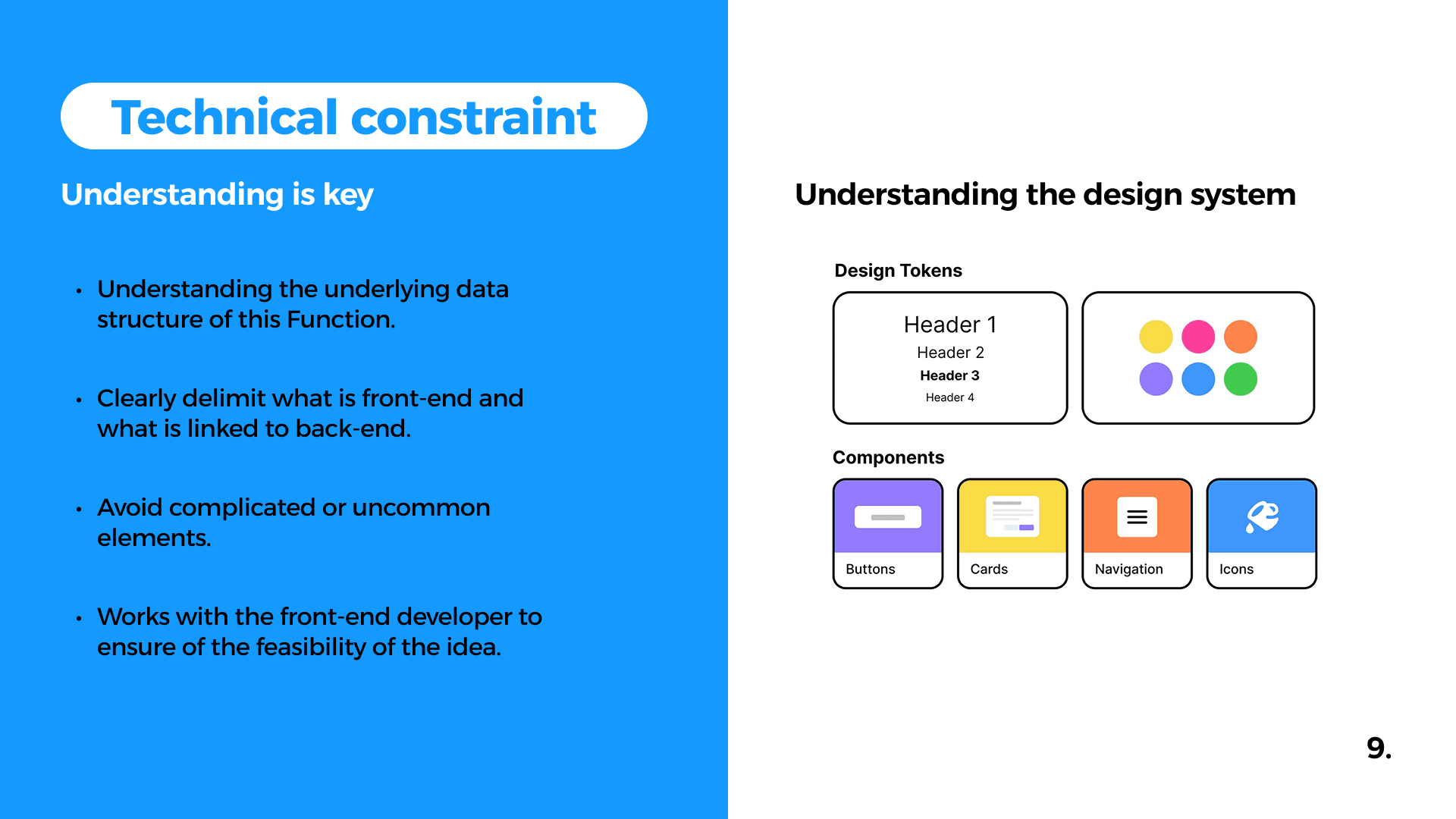
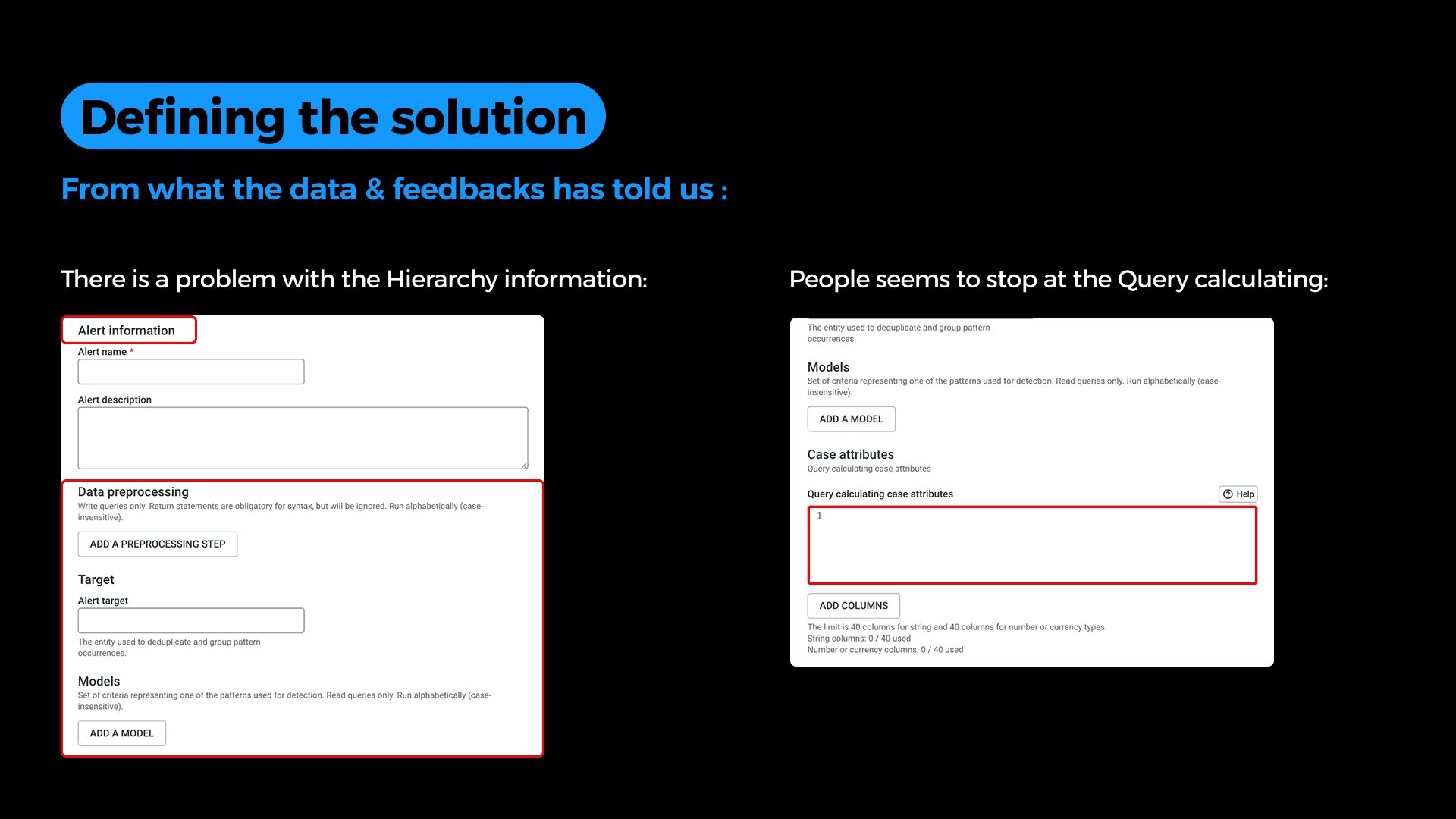
The idea is now to start searching where is the problem mainly be. Here from the data we got we can understand that the mains problems come from. Here we can see that two of the mains problems are :
- Information priorisation
- Query calculating inputs
- Data preprocessing.
This version mainly focus on the idea of a low effort modification, So the mains changes are to more easily prioritize the way information is given to the user.
However it was made in mind that this version, can also help to ease a transition from the original version to the version 2. Which is a more complete and definitive.
Keep in mind this is a basic wireframe not a definitive version of the solution.


This version is a big upgrade from the usual use of the current page. Here the main problem from the priorization of the information is that it needs all the inputs from the user in a single page. So i've decided to change this to page comparable of the interface of Youtube when uploading a video. This mean every information are gradually showned by clicking on next. The differents information to put are displayed by a stepper.
Conclusions
Looking Ahead ✨
This use case was a valuable learning experience that deepened my understanding of how crucial data is to the UX design process. It highlighted how, without real user data or feedback, designers can easily fall into the trap of survivorship bias, making assumptions based on limited or misleading information. This can ultimately lead to design decisions that miss the real needs of users and fail to solve the right problems.
Although I wasn’t selected by Linkurious following this exercise, I’m grateful they gave me the opportunity to work on a real-world problem and allowed me to showcase this case study in my portfolio.
Next Steps 👣
Building on this experience, I plan to deepen my skills in data-informed design and explore more complex problem spaces. I aim to collaborate closely with users and developers to design solutions grounded in real needs. This project reinforced my commitment to thoughtful, user-centered design in every step of the process.


